SaveEat
Fighting food waste
"Inspired by the app "SpareEat
Project Overview
For the past year or so, I have been using an app called “SpareEat”.
“SpareEat” is an app that lets users purchase surprise bags from cafes, bakeries and restaurants for half price near closing time. This way, restaurant owners can minimize food waste and users can try different foods for a low price.
I love discovering new places around me, and thanks to this app I got to try food that I wouldn’t necessarily order myself. I found many new places that I later returned to and purchased food at full price, outside of the surprise bag offers, and enjoyed them.
As a frequent user of SpareEat, I saw an opportunity to improve its usability and aesthetics. This case study outlines my redesign process to enhance the user experience.
I had sent the wireframes and some of my thoughts to the team via customer support. They thanked me and said they would take these points into consideration, some of which has already been implemented 🙂
Research & User Insight
I started by talking with some of my friends who use the app in order to hear their opinions about it. Overall, it seemed like they were pretty happy with the app, it is easy to use, pretty intuitive, customer support is great and they were mostly happy with the bags they got which caused their overall view of the app to be very positive. However, they did raise a few pain points that I summed up with mine-
- The businesses show in an order that is based on the users’ current location. In order to set your location the user has to edit it under “Profile”. Most food apps (delivery and pickup) let the users set their own location manually or add a few addresses and toggle between them. This way when GPS is down or disabled (which happened a lot recently), users can still see which businesses are closest to them.
- There aren’t reviews for the bags, in an age where all food apps have restaurant ratings and people posting reviews on the bag on Facebook groups, reviews mean a lot to users. They want to hear other people’s experiences, get answers to questions they have and know if the bag fits them. Not having the reviews adds to the uncertainty the user is already experiencing by not knowing what items they will get.
- There isn’t a lot of information inside the business’ page regarding what is in the bag. The descriptions are pretty vague and users may not know what they can get unless they are familiar with the business. It’s understood there can’t be any commitments to specific items as the bags are made of the items that are left, but maybe there can be a bit more information.
- There isn’t an option to request a vegan/vegetarian/add a restriction to a bag. I used to be vegetarian and purchased a bag that was packed before I got there, and when I got home I found that 1 of the 4 items I got (which was also the priciest and biggest one of them) had fish in it, it made my experience unpleasant as I payed for something I can’t eat, and it goes against the idea of preventing food waste.
- There isn’t an option to “Favorite” a business, so if users want to keep track of the bags they like or have quick access to a place they like- they can’t do it.
- The design feels outdated compared to food delivery apps.
- On “My Orders”- the design is very dark, users can’t see how they rated the business, there is a lot of unnecessary information that makes it look cluttered.
- Profile page- unclear why there is a profile page and a sidebar, it’s unlike any other app and the information is divided which makes it not friendly for users. For example, users would usually go to “Profile” to contact support, but in this case the support is under the sidebar and not “Profile”. These screens don’t look like they are from the same app, the design is inconsistent.
Problem Statement
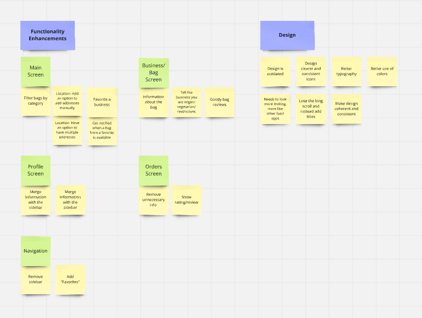
Having these pain points, I started to write down some ideas and ways to overcome them.
Since this project is based on an existing app, I looked into the existing screens and wrote down the key points that need to be addressed in the design process.
Functionality Issues
Missing an option to favorite bags.
Missing an option to choose/add a location manually.
Missing an option to filter bags by category.
Missing an option to add dietary restrictions.
Not enough information about the bag (no reviews, vague details), which may cause users to give up on trying the bags.
Users struggle to find the information they need while screens feel cluttered with unnecessary details.
Design Issues
The color scheme is not “inviting,” sometimes too dark or lifeless.
The design feels outdated.
Users have to scroll through all businesses, most of which are not relevant to them.
I used Miro to organize these ideas into groups.
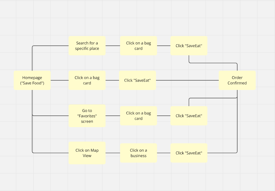
Since I added a few screens and changed the flow, I created a flow map of the process of placing an order, using Miro.
Design Process
With these points organized and separated to groups and screens and a flow map of the main flow, I felt confident and ready to start designing.

The Navigation Bar
- Replaced the sidebar with a “Favorites” icon for quick access.
Made icons more uniform, switching them to outlined versions with rounded corners.
Home Screen
- Added an address line that shows the current address (based on location) with a clickable down arrow where the user can change or set an address. Users can also set the radius of businesses relevant to them.
Added a more visible search bar with an option to filter results and a map view.
Introduced a “Save by Category” section where users can filter results by options like “Produce,” “Pastries,” “Meals,” and an “All” option selected by default.
Instead of a long scroll, I created titled sections (Favorites, Nearby, etc.) with horizontal scrolls, similar to popular food pickup/delivery apps. This way, the user sees the businesses relevant to them first.
The user can also click on “View All” to see a list view (column layout like the original app) of this category.Bag cards now include price, pickup date and time, rating, category icon, and an option to favorite a bag/business.
Removed the crossed original price from the cards to reduce clutter; instead, it will be displayed on the bag screen.
- Map view – similar to the original app with slight design changes.
- Filter- users can filter businesses according to dietary restrictions and pickup time


Business / Bag screen
- Kept the layout similar to the original design but displayed the original value of the bag on the enlarged card.
Improved descriptions to provide more information on what the bag contains.
Added user reviews that focus on the experience rather than specific bag contents.
Added an option for users to mark whether they are vegan or vegetarian for bags that may contain animal products.

Orders Screen
Removed unnecessary information (e.g., pickup time for past orders) for a cleaner design.
Added an option for users to view their past reviews to track their experiences.
")
Profile Screen
- Merged sidebar information into a single, uniform layout where users can manage personal details, payment settings, and app preferences, and contact support in one place.
- Organized information into clearly separated sections for better accessibility.

Favorites Screen
- Created a screen similar to the home screen but with a simpler column layout instead of carousels.
Kept search and filter options to allow sorting favorite bags by category.

Colors and Fonts
I chose to use the font "Inter" as it is a clean and calm font, it is easy to read and feels modern.
Titles- 16px
Subtitles- 14px
Text- 12px
Small text- 10px
I kept the colors similar to the original app, using shades of green and grey.
Final Design
This redesign aims to enhance the overall user experience by improving navigation, adding much-needed functionality, and updating the app’s aesthetics to align with modern design standards.
By addressing both usability and design concerns, this project creates a more intuitive and enjoyable experience for SaveEat users.
Home Screen


Favorites Screen

Profile Screen

Orders Screen

Business / Bag Screen
